


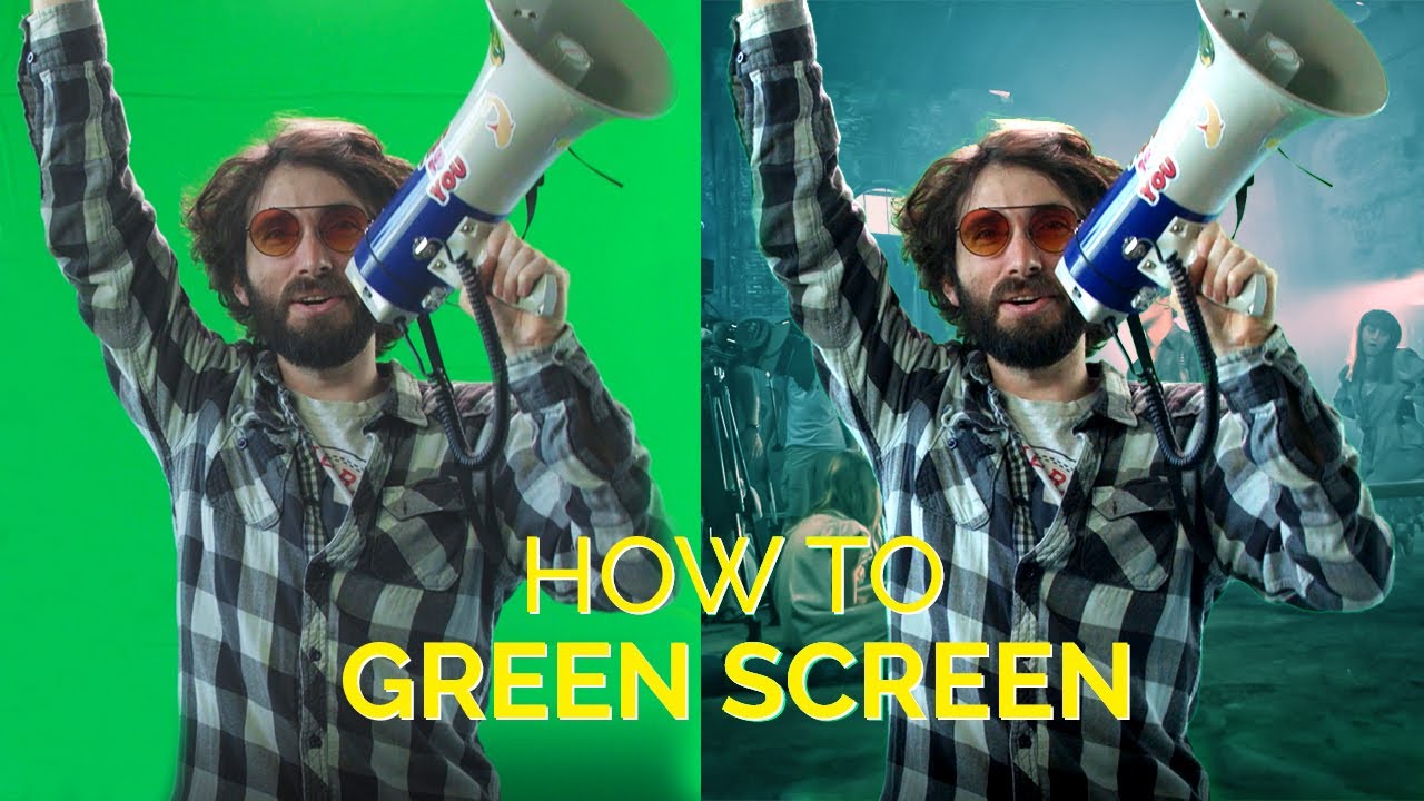
When it comes to filmmaking and video production, creating the perfect backdrop can be a game-changer for your creative projects. That’s where blue and green screens come in — an innovative technique that allows creators to shoot against a solid color so new backgrounds can be dropped into the scene — a cold bedroom quickly becomes a warm palm tree-filled beach.
Also known as Chroma Key extraction, this post-production editing trick is used in everything, from weather bulletins to big-budget Hollywood movies. It can give filmmakers a lot of flexibility and save time and money. To achieve the quality footage your creatives deserve, we have set out everything you need to know about using a blue and/or green screen.
The difference between blue and green screen
Whether you’re crafting Hollywood-level effects or simply refining a YouTube vlog, swapping one background for another is a vital video trick, but how do you know — green or blue? The choice boils down to their unique properties and how they interact with lighting, colors, and the subjects in your shot. Understanding these differences and when to use each will ensure you achieve a professional result every time.
There are two important differences that will determine which one you use for your video creations.
- Blue is 33% less reflective than green. Green has a brighter natural luminance than blue, which makes it more reflective and prone to color spill.
- Green contrasts most with the red of human skin tone — it opposes red on the color wheel. This is useful to get maximum contrast with the reddish, pink complexions of actors.
Tip: Shooting blue screen instead of green screen requires a higher f-stop setting (aperture size) on your camera.
What difference does “luminance” make?
Luminance refers to brightness and the perception of how bright a color is. So, it matters for a colored reflective surface.
Blue or green screens work best when the brightness of this color is solid, flat, and consistent.

Often on-set screens appear more neon-bright in hue. This can help to contrast more sharply with any more neutral blues and greens in the foreground shot. And remember, screen luminance is made significantly brighter by lighting.
Selecting green screen or blue screen for your project
Picking green, blue, or even red for a screen is ultimately about contrast. You want the color that is unique enough behind your shot to cleanly “key” it out.
Choosing between green and blue screen can depend on certain filming situations:
|
Use green screen |
Use blue screen |
|
Strong definition needed between actor flesh or red costumes. |
Foreground (actors, set, props etc) contains heavy use of green colors. |
|
Lighting is limited so more reflective luminance is wanted on set. |
Filming for dark, nighttime backdrop with reduced luminosity and light “spill” needed. |
|
Shooting with digital video cameras rather than on film stock. |
Color correction process needs to be made easier and more accurate. |
Think about the shot in terms of color and lighting. Consider the foreground scene you will keep and how it should look inside the new background environment.
Maybe your film will use both green and blue screens for different scenes?

Besides color, what type of screen should I use?
The material your screen is made of is also an important consideration.
A painted flat, smooth wall or hard screen structure is expensive but works best. Use a matte finish rather than gloss to reduce reflection.
Homemade green screen solutions can be cheap and effective too. Fabric like curtains, sheets or drapes are useful but also rolls of paper or card.
Avoid heavily textured or shiny material, free of wrinkles or creases preferably!


Expert tips for green screen filming
A few months ago Artlist launched a campaign to promote our Friend-to-Friend referral program. When making the campaign’s commercial, we used a green screen and wanted to share the dos and don’ts of this highly useful method directly from our creative experts.
How to use a green (or blue) screen
1. Stretch it as tight as you can
Your green screen needs to be as smooth as possible. Any wrinkle or deformity will create unwanted shadows, making it harder to cut your subject out of it. Clamps are a good way to hold your fabric tight.
2. Keep your distance
Placing your subject too close to the green screen will result in shadows on the screen or light spills on your subject. Light spills are especially problematic because they can be missed when shooting, and once you see them in post-production, they can be challenging to key out. You need to make sure to place the subject at a good distance from your green screen.
3. Enhance separation with backlight
The more separation you have between your talent and the green screen, the better, as it will be easier to key it out later. Once you’ve set the distance, separate the subject even more with backlight.
4. Light it evenly
When your green screen lighting is even, it will make the process of keying it out so much smoother.

5. Shoot on a high shutter speed
If you film fast movements, the camera will have a hard time picking out the movements from the green screen, resulting in motion blurs. Using 1/250 seconds shutter speed or higher will ensure you won’t get any blurs.
6. Avoid green items
This is kind of obvious, but we’re going to say it anyway. The enemy of the green screen is the color green, so don’t dress your subjects in anything green or use any green accessories.
Now that we covered the green screen basics, let’s dive into the two sets we used to shoot this commercial and the transition between them.
Setting the scene
Jane is our heroine. She’s a fashion vlogger who uses Artlist for access to a large library of high-quality vlog music. We knew we needed to make her room look fresh and poppy, so we used props with vibrant colors. To deepen her character, we placed some Easter eggs in her room in the form of two big posters with album art from our site and texts that are relevant to the friendship theme of our commercial, like ‘Tell Your Friends’ and ‘Lifetime of Music’, both referring to the lifetime subscription you can win if 10 of your friends subscribe to Artlist through your personal link.
One of our Easter eggs
To separate Jane from the background, we had the Westcott Flex RGB for the backlight. For the key light to focus on our subject and eliminate any spills on the back wall, we mounted a snoot to the Aputure 120d. We also relied on natural sunlight and added a diffuser next to the window to get a softer look. To capture that sunset vibe, we set the Arri SkyPanel on orange light and placed it outside the window as well.
In this production, we recorded sound live, so we needed to dry up the set. To make the room sound like a real bedroom, we installed echo-eliminating acoustic panels. We recorded the sound using a Sennheiser Lavalier mic and a Røde shotgun mic. However, we didn’t want to place all our chips on the sound from the set, so we recorded sound in dubbing as a back-up.
The editing room set

We wanted the room to seem like it belonged to a pro editor, so we hung 3 posters on the wall that looked like they were for films he worked on. Here we also added texts that are relevant to our theme, like ‘Friendship Matters’ and ‘Lifetime of Music’. To light them, we used the Spekular Spiffy gears and added yellow gels to create a nice color contrast between the posters and the editor, who was lit with daylight temperature.
To build the pro editing station, we added a Blackmagic Design DaVinci Resolve Micro Panel, 3 monitors, and a big-screen TV. For the lighting, we used the Aputure 120d for the key light to make our filmmaker pop out of the frame. Since most editing rooms have some colored lights, we also used the Westcott RGB for the fill light on our filmmaker.
The transition
The transition between the two rooms illustrates our characters’ close friendship, so we built the two sets in a way that enabled the camera to easily move between them. The rooms you see between the sets were composited in Cinema 4D, while the city background and the characters in the rooms were composited in After Effects. To give the transition more style, we added some Optical Flares from Video Copilot.
That’s a wrap
Now you know your green screen ABCs. Check out our tips for creating contrast through color grading and join us for the next BTS to learn more pro filmmaking tips and tricks. In the meantime, stay creative!
Did you find this article useful?


